
Last Updated Jan 12, 2026
A fun, unintrusive scroll animation
Categories: Design
Tags: #CSS , #Animation , #Tailwind CSS , #Special effects
My last post was about using state machines to control the selected theme on my redesigned site.
What made me decide to redesign was actually what this post is about: creating a fun scroll animation as part of a new dark theme.
Some background
When I first saw scroll animations years ago, like the ones Google used to design for their products, I thought they were really cool. Then after a few years of listening to others about UX and getting annoyed myself at most scroll-jacking behavior, I came around to thinking of them as simply a nuisance.
Note: I'm not picking on the Codepen user below; I just needed an example. The idea is still eye-catching and probably a fun exercise.
But this is an example of the kind of scroll animation I'm talking aobut. While cool-looking, it can make scrolling sluggish and information harder to get to.
Anyway, despite coming around to that opinion, I recently decided to look into scroll animations as a fun challenge, and how I might make one that wasn't intrusive.
Accessing the animation
My idea was a cogwheel of sorts that raises and lowers a steel rail on the side of the screen. I landed on a design that looks like it could be raising and lowering the website itself in your browser viewport.
- Note: it's hidden on mobile due to being a bit bulky. You'll have to view this page on your computer to see it.
To access it, you have to be using dark mode. If you don't default to dark mode, open the cogwheel menu and set Display Mode to Dark Mode.
Then select the Display Theme dropdown and choose "Industrial" (possibly a corny placeholder name, but maybe it'll grow on me).

On either side of your screen, you should see something like this:
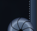
When you scroll, it'll glow and also spin according to your scroll direction. The rail will be from the bottom of the header to the bottom of the page.
Designing the animation
I had so much fun creating this. I was also surprised at how much I enjoyed creating the SVGs, not just figuring out the animation.
But the hardest part was making the scroll rotation believable. I'll go over that further down.
The wheel
My original idea was actually more steampunk and I was leaning towards using deep blues and pastel, rusty oranges instead. But I landed on something futuristic/cybernetic — just how I...roll. 😎
The wheels are SVGs I designed in Inkscape. I created a few layered radial gradients, added a single black curve to help reinforce the shape I was going for, then copied and rotated that curve several times to create the segments.
The glow effect is a separate SVG that shows on scroll. I used a copy of the black lines and middle hole to create the glow layer.
The SVG for both are embedded in this component.
The rails
These are made completely with CSS, including the track teeth.
The track background is a dark, to less-dark, to dark gradient to shape the metal beam, plus a small border at the right side where the teeth would rest:
<div class="relative w-5">
	<div class="w-full h-full bg-gradient-to-r from-slate-800 via-slate-700 via-80% to-slate-600 border-r-2 border-solid border-r-slate-800"></div>
</div>
And the teeth are made with a repeating gradient with sharp color stops. The HTML is just this:
<div class='teeth relative w-0.5 h-full'></div>
This is the gradient for the teeth:
.sidebar-track .teeth {
	background: repeating-linear-gradient(
		to bottom,
		var(--background-color-slate-400) 0,
		var(--background-color-slate-400) calc(var(--spacing-1) * 0.5),
		var(--background-color-black) calc(var(--spacing-1) * 0.5),
		var(--background-color-black) calc(var(--spacing-1) * 2)
	);
}
Since I'm using Tailwind 4, I was able to use its CSS vars for my colors and spacing.
Lastly, the track glow was a radial gradient. Since it was simple enough, I just did it with Tailwind:
<div class='-ml-px2 w-full h-full bg-radial-[at_100%_100%] from-bright-turquoise-200/50 via-bright-turquoise-500/40 via-30% to-transparent to-50%'></div>
Animating on scroll
I started building a proof of concept in Tailwind Play.
I watched Kevin Powell's YouTube video talking about using scroll() in CSS. I was playing with it in Tailwind Play and it worked. So after figuring out how I wanted it to work, I started moving it to my site.
But when I moved it, it wasn't working anymore. Then I came across a CSS Tricks article that specifically mentioned that the CSS scroll() function was only experimental. Whoops. 😅
After that, I modified my old solution to use CSS custom properties, which I learned can be updated with JavaScript.
The first part is a PageMeasurementsModel class that just knows how to get the necessary page measurements. It records the body height, scrollable distance, and scroll percent as CSS custom properties:
export class PageMeasurementsModel {
	getScrollableDistance() {
		return (
			document.documentElement.scrollHeight -
			document.documentElement.clientHeight
		)
	}

	initMeasurements() {
		this.setStaticMeasurements()
		this.setScrollPercent()
	}

	static register() {
		new PageMeasurementsModel().register()
	}

	register() {
		window.addEventListener('scroll', this.setScrollPercent.bind(this))

		window.addEventListener('load', () => {
			window.addEventListener(
				'livewire:navigated',
				this.initMeasurements.bind(this),
			)
			this.initMeasurements()
		})

		window.addEventListener('resize', this.setStaticMeasurements.bind(this))

		this.setStaticMeasurements()
	}

	setStaticMeasurements() {
		document.documentElement.style.setProperty(
			'--body-height',
			`${document.documentElement.scrollHeight}px`,
		)
		document.documentElement.style.setProperty(
			'--scrollable-distance',
			this.getScrollableDistance().toString(),
		)
	}

	setScrollPercent() {
		document.documentElement.style.setProperty(
			'--scroll-percent',

			/* basically: scroll position / (document - viewport) */
			(
				document.documentElement.scrollTop / this.getScrollableDistance()
			).toString(),
		)
	}
}
The second part is a WheelSizeModel class that records the wheel wrapper's radius size in pixels. It does this on load, livewire:transition, and resize.
export class WheelSizeModel {
	wheel: HTMLElement

	recordWheelSize() {
		document.documentElement.style.setProperty(
			'--wheel-outer-radius',
			(this.wheel.offsetWidth / 2).toString(),
		)
	}

	static register() {
		new WheelSizeModel().register()
	}

	register() {
		window.addEventListener('load', this.setUpWheel.bind(this))
		window.addEventListener('livewire:navigated', this.setUpWheel.bind(this))
		window.addEventListener('resize', this.recordWheelSize.bind(this))
	}

	setUpWheel() {
		if (!!this.wheel) return

		this.wheel = document.querySelector<HTMLElement>('.scroller-housing .wheel')

		this.recordWheelSize()
	}
}
I do this only because, despite much of Tailwind using rem measurements, the rotation depends on pixel measurements, which means they may not always be knowable before everything is rendered.
The third part is a ScrollEffectsController class that starts and stops the special effects. This mostly watches for scroll events and adds or removes a scroll class on the <body>.
- Note: you can ignore the livewire events below. I use Laravel Livewire, so listening for those is necessary for page transitions.
export class ScrollEffectsController {
	static init() {
		new ScrollEffectsController().init()
	}

	init() {
		window.addEventListener('scroll', this.enableScrollEffects.bind(this))
		window.addEventListener('scrollend', this.disableScrollEffects.bind(this))

		window.addEventListener('load', () => {
			window.addEventListener(
				'livewire:navigated',
				this.scrollEffectInit.bind(this),
			)
			this.scrollEffectInit()
		})
	}

	enableScrollEffects() {
		document.documentElement.classList.add('scroll')
	}

	disableScrollEffects() {
		document.documentElement.classList.remove('scroll')
	}

	scrollEffectInit() {
		this.disableScrollEffects()
	}
}
This scroll class is used for a custom Tailwind variant:
@custom-variant scroll (&:is(.scroll *));
This lets me classes prefixed with scroll: to control whether Tailwind styles are applied to an element, like this:
<div class="opacity-0 scroll:opacity-100 transition-opacity"></div>
So now when I have <body class="scroll">, these styles will apply. I use this for both the glow effect on the wheel and the track.
And here's the CSS used to control the animation. It's just using a lot of calc() to measure how far the wheel needs to turn:
@layer base {
	:root {
		--body-height: 0;

		/* I think this is being interpreted as pixel size, so treating it that way */
		--wheel-outer-radius: 64;
		--size-inset: calc(var(--wheel-outer-radius) / 2);
		--inner-radius: calc(var(--wheel-outer-radius) - var(--size-inset));

		--scroll-percent: 0;
		--scrollable-distance: 0;
	}
}

.scroller-housing {
	--wheel-circumference: calc(2 * calc(pi) * var(--inner-radius));
	--turn-multiplier: 1turn;

	--rotations: calc(var(--scrollable-distance) / var(--wheel-circumference));

	&.mirrored {
		--turn-multiplier: -1turn;
	}

	.wheel {
		/* --turn-multiplier is necessary to tell it how many turns to make */
		rotate: calc(var(--rotations) * var(--scroll-percent) * var(--turn-multiplier));
	}
}
Here's what the housing component markup looks like:
<!-- wheel/rail housing component -->
<div @class([
	'scroller-housing',
	'mirrored' => $mirror,
	'absolute',
	'h-full',
	'top-0',
	'left-0' => !$mirror,
	'right-0' => $mirror,
	'z-20',
])>
	<div class='relative h-full w-full'>
		<x-scroller.track :mirror='$mirror' />
		<x-scroller.wheel :mirror='$mirror' />
	</div>
</div>
Mirroring
This sounds like something that's stupidly easy: just copy the housing component, add transform: scaleX(100%), and move it to the right.
It worked! But then I noticed 1 of the wheels was missing. Scrolling down, I found the mirrored wheel at the bottom of the page.
Weirdly, when an element with position: fixed is inside a parent that's scaled (like the sample below), the fixed element will act like it has position: absolute.
<div class="-scale-x-100">
	<div class="fixed bottom-0 left-0"></div>
</div>
I have to assume this is a CSS bug. But working around this wasn't bad once I realized what was going on.
If you look at the housing code snippet above, you'll see that when mirroring is on, the housing component only moves. But it'll pass $mirror down to the rail and wheel components, which do scale separately.
Here are links to the full component markup for each:
Other things learned
1. Don't forget to check "Can I Use"
Seriously, check it. Even if something works on a third-party frontend playground like Tailwind Play or JSFiddle, it might be that they're using a polyfill for an experimental feature. I forgot this time until I was building the real thing with scroll(), but I'm thankful that there was another way that wasn't much harder.
2. Tailwind variants for effects
This was relatively minor compared to the other things, but creating a scroll variant to control when special effects should show or hide was a cool trick to learn.
3. More applied math
Even though it's not my favorite part, problems that require common math equations are fun too — frustrating at times, but fun. Figuring out the circumference of a theoretical inner circle for this animation was a good (though definitely frustrating) brain teaser.
Eventually, I also realized I was making some wrong assumptions while building that CSS math spaghetti above that were throwing the whole thing off:
- When setting the initial wheel measurements, for some reason, I was thinking in terms of Tailwinds
remmultipliers (like the 16 inw-16, which is basicallywidth: calc(16 * 0.25). I needed to go by pixel numbers intead. - For some reason, I didn't think to check if I was measuring the SVG size or the container size. But it turned out to be the container, which was much larger.
Once I fixed the issues above, the wheel animation speed felt much more real.
4. CSS transforms can break positioning
This was my first time mixing transforms and fixed positioning, so this was definitely a weird one for me. I'm hoping it's just a CSS bug and it gets fixed. But I'm glad it was at least easy to work around.
Final notes
I wanted to include a light version of this at first, but I decided against it. It was just going to be a lot more work and wouldn't have looked as cool in light mode (at least, not the design I had in mind).
But it was a really fun exercise, and I'm pretty dang happy with how the special effects came out.
Lastly, even though I made the wheel graphics myself, the dark, grungy background used a background image by kjpargeter on Freepik. It's credited and linked on the new Credits page.
Thanks for reading!
3 months ago
JSn1nj4 pushed to master at JSn1nj4/ElliotDerhay.com
3 months ago
JSn1nj4 pushed to develop at JSn1nj4/ElliotDerhay.com
3 months ago
JSn1nj4 pushed to develop at JSn1nj4/ElliotDerhay.com
3 months ago
JSn1nj4 pushed to master at JSn1nj4/ElliotDerhay.com
3 months ago
JSn1nj4 deleted jsn1nj4/jsn-335-refresh-view-live-button-url from JSn1nj4/ElliotDerhay.com